How to Translate Your Business Personality Into a Visual Identity
Every business has a personality.
Some feel calm and understated. Others feel energetic, expressive or quietly confident. Some communicate decades of expertise, while others introduce a fresh perspective that challenges expectations.
The difficulty isn't defining these qualities. It's translating them into design.
Many businesses begin by collecting logos, colour palettes and Pinterest inspiration. While visual references can be helpful, they rarely answer the most important question.
How should someone feel when they discover your business for the first time?
That emotional impression becomes the foundation of a visual identity.
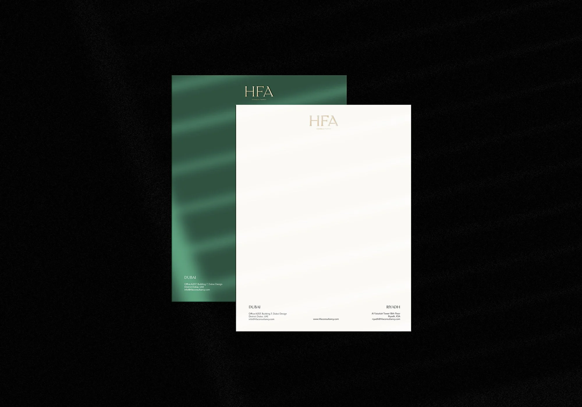
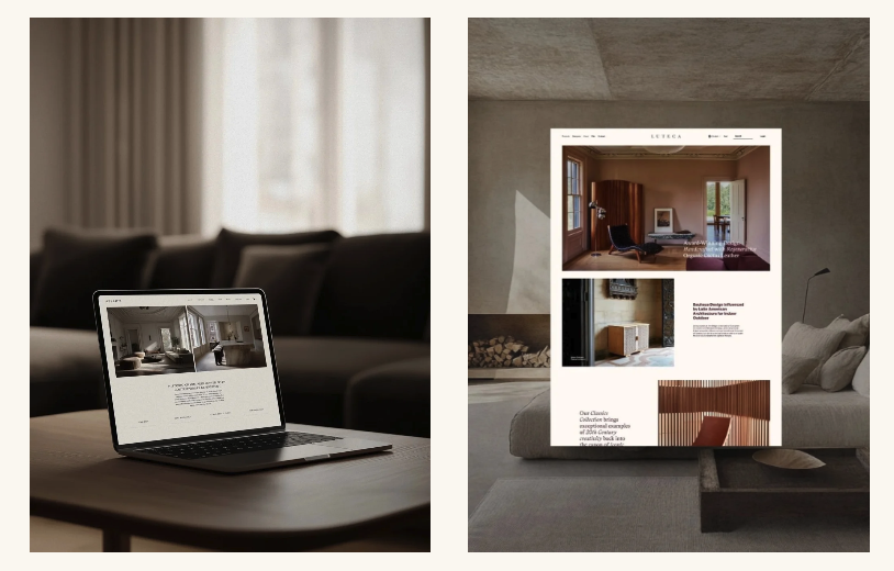
HFA Consultancy. Full-service PR and communications agency
Start with personality, not aesthetics
Visual identity is often mistaken for personal preference.
You might like minimalist websites, colourful packaging or vintage typography, but those preferences should not determine how your business presents itself.
Instead, begin with the characteristics you want clients to associate with your work.
Perhaps you want your interior design studio to feel calm, architectural and quietly sophisticated. A wellness consultancy may want to appear reassuring, knowledgeable and approachable. A contemporary homeware brand might prioritise curiosity, craftsmanship and creativity.
These qualities become creative direction rather than decorative inspiration.
Define a small number of core characteristics
One of the most common branding mistakes is trying to communicate everything at once.
Businesses often want to feel premium, approachable, creative, innovative, luxurious, playful, professional and timeless simultaneously.
The result is usually a visual identity with no clear point of view.
Instead, choose three or four characteristics that genuinely describe the business.
For example:
Calm
Refined
Contemporary
Thoughtful
Or perhaps:
Bold
Expressive
Creative
Confident
These words are not intended for your website copy. They become creative filters that influence every design decision that follows.
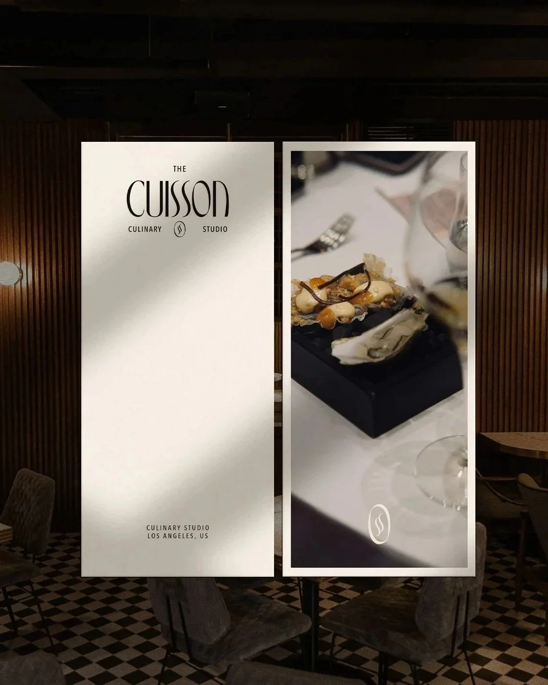
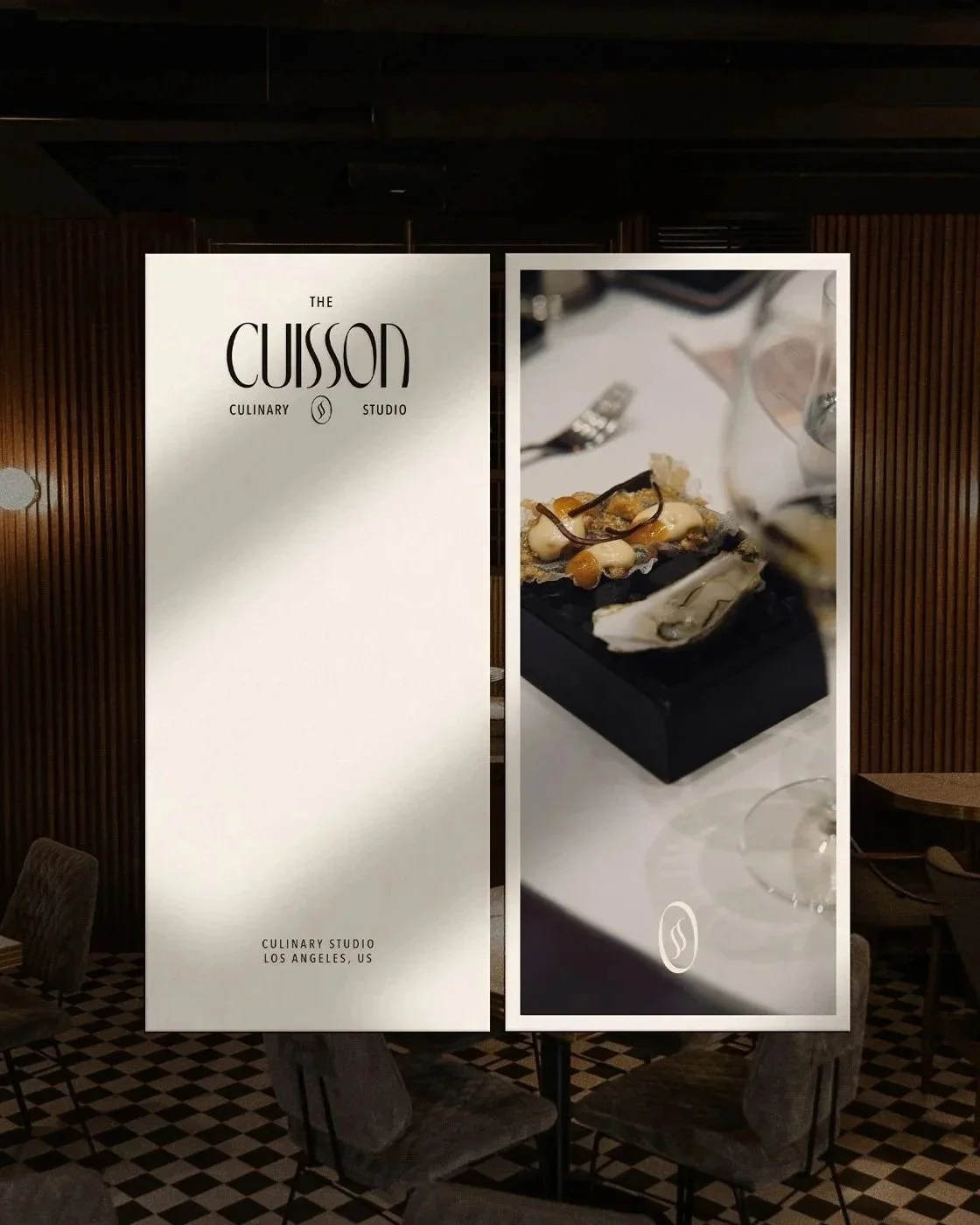
The Cuisson is a modern culinary studio created by chef Duyen Ha.
Typography is often the strongest expression of personality
Typography communicates before anyone begins reading.
A restrained serif can suggest heritage or refinement. A geometric sans serif may feel contemporary and structured. A more expressive display typeface can introduce confidence, creativity or warmth.
The goal is not to select fonts that look expensive. It is to choose typography that reflects the character of the business.
For example, when we created the identity for The Cuisson, we chose a bold display typeface with a subtle French influence. Rather than relying on familiar culinary clichés, the typography introduced a contemporary personality that reflected chef Duyen Ha's experience studying in France while remaining distinctive in its own right.
Colour should support emotion
Colour is often one of the first decisions people think about, yet it should rarely be the first decision made.
Different colours carry different cultural associations, but context matters far more than symbolism.
An emerald green can feel sophisticated in one identity and playful in another. Terracotta might suggest craftsmanship, hospitality or warmth depending on how it is combined with typography, imagery and layout.
Rather than asking which colours are fashionable, consider which atmosphere they create when working together.
The strongest palettes feel intentional because each colour has a purpose.
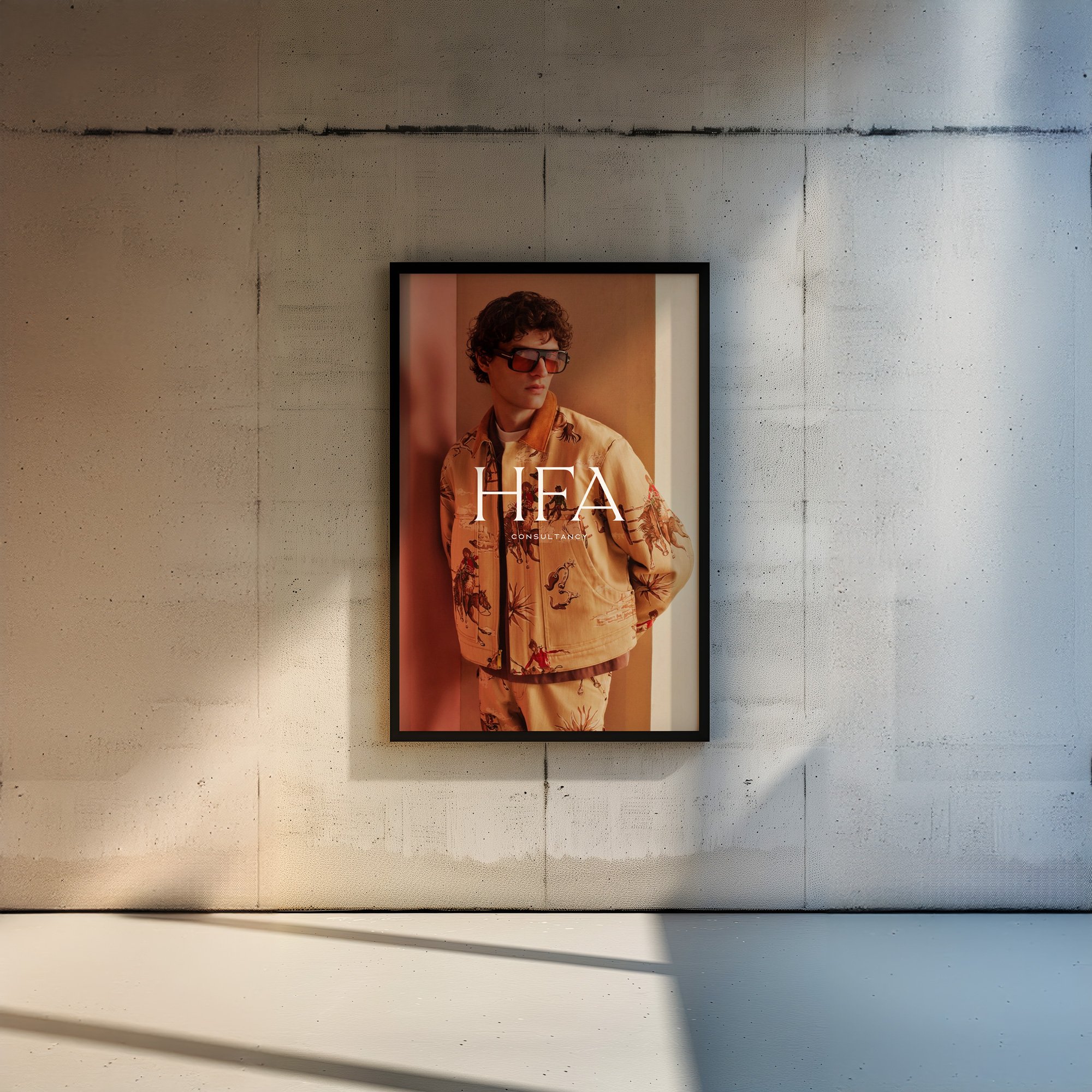
HFA Consultancy. Full-service PR and communications agency
Photography defines the world around the brand
Photography often communicates personality more quickly than a logo.
Ask yourself:
Are the images highly styled or quietly documentary?
Do they focus on people, details or environments?
Are they carefully composed or intentionally spontaneous?
Do they create distance or intimacy?
An interior design studio might use architectural compositions with generous space and natural light, while a culinary brand may favour close crops, movement and texture.
The style should feel consistent across the website, social media and printed materials so that the business becomes immediately recognisable.
Layout creates rhythm
Visual identity extends beyond individual assets.
The way information is organised also shapes personality.
A spacious editorial layout encourages visitors to slow down. Strong grids and precise alignment communicate clarity and structure. Layered compositions can introduce energy and experimentation.
This is why two businesses using similar typography and colours can still feel completely different online.
Personality exists in the pacing of the experience as much as the visual elements themselves.
Consistency builds recognition
A recognisable brand is rarely created by one memorable logo.
It comes from repetition.
Typography, colours, photography, spacing, illustration style, icons, tone of voice and layout should work together consistently across every touchpoint.
This doesn't mean every piece of communication should look identical.
Instead, everything should feel as though it belongs to the same business.
Recognition grows through familiarity.
Personality should reflect the business you are becoming
For new businesses, this often means defining how you want to be perceived from the beginning rather than waiting until the business grows.
For established businesses, it may involve recognising that the personality communicated today no longer reflects the calibre, direction or ambitions of the work.
A rebrand is rarely about becoming someone else.
It is about creating a clearer visual expression of who the business has become.
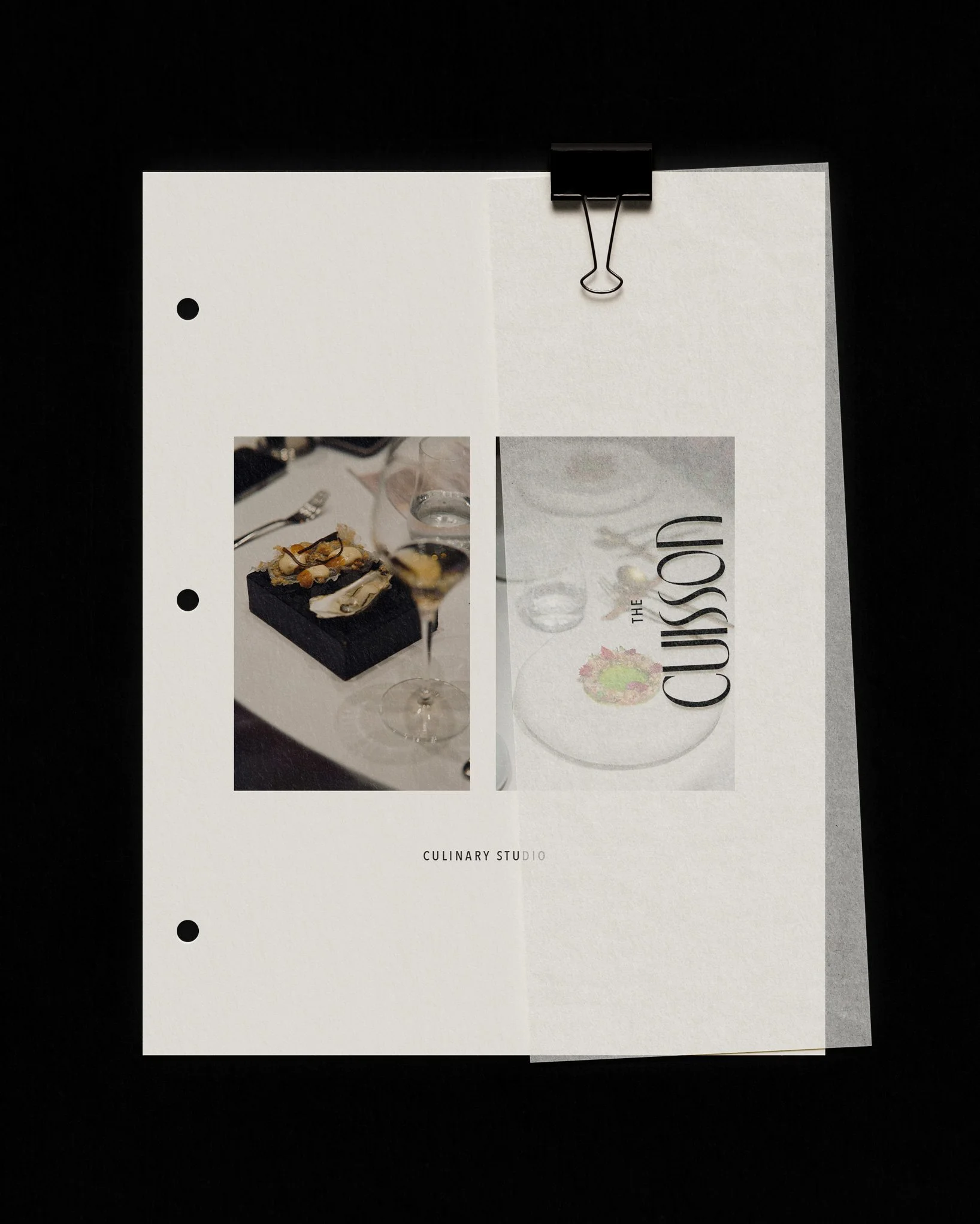
The Cuisson is a modern culinary studio created by chef Duyen Ha.
Frequently asked questions
What is business personality?
Business personality describes the human qualities people associate with a brand, such as calm, confident, creative or approachable. These characteristics influence design, messaging and customer experience.
What is the difference between brand personality and visual identity?
Brand personality describes how a business should feel. Visual identity is the collection of design elements, including typography, colour, imagery and layout, that communicate those qualities.
Can two businesses have similar personalities?
Yes. The difference comes from how those qualities are interpreted through strategy and design. Two interior studios may both feel refined, yet express that quality through completely different typography, colour palettes and photography.
Should my personal style influence my branding?
Your personal taste can provide inspiration, but the identity should primarily reflect your business positioning, audience and long-term ambitions rather than your individual preferences.
Good branding doesn't invent personality. It reveals it.
The strongest visual identities don't begin with colours or logos.
They begin with understanding what the business should communicate before a single word is read.
When every creative decision supports that idea, the identity becomes recognisable, memorable and easier for the right clients to trust.
At Avelã Creative, we create strategic brand identities that translate business personality into thoughtful visual systems designed to support long-term growth. Explore our Brand Identity service or start a project to begin shaping a brand that feels unmistakably yours.
Where to Start
Your visual identity should communicate your business before you introduce yourself. Explore our Brand Identity service or start a project to create a brand that's built around who you are and where your business is going.