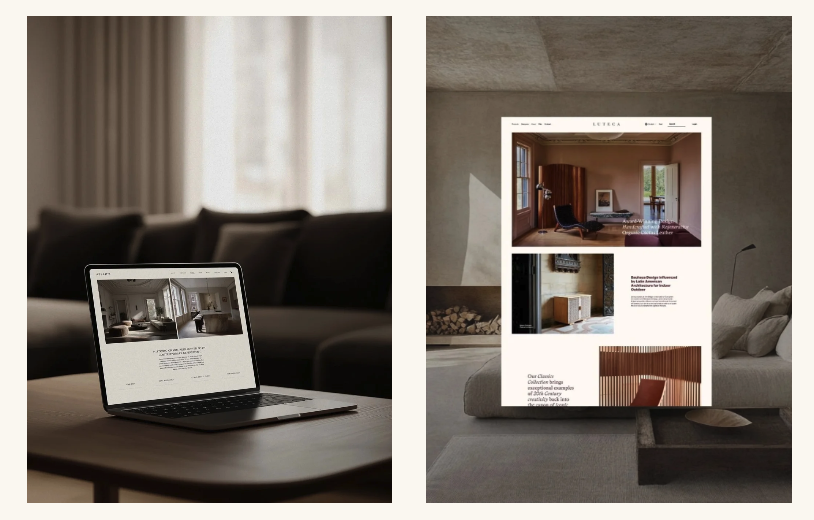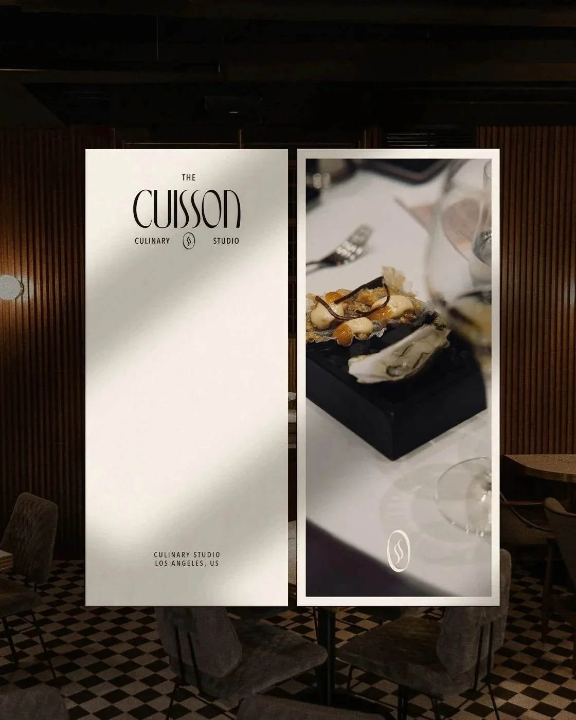
10 Details That Make a Website Feel More Expensive
An expensive looking website is rarely defined by one dramatic feature.
It is created through dozens of smaller decisions that feel controlled and connected. The typography supports the content. The imagery belongs to the brand. The spacing creates a clear rhythm. Nothing appears to have been added simply because the platform made it available.
This does not mean every premium website needs to be minimalist, neutral or restrained. A colourful e-commerce brand and a quiet interior design studio can both communicate significant value. The visual expression may be completely different, but the level of judgement behind it should feel equally strong.
Here are ten details that can make a website feel more expensive without relying on predictable design formulas.
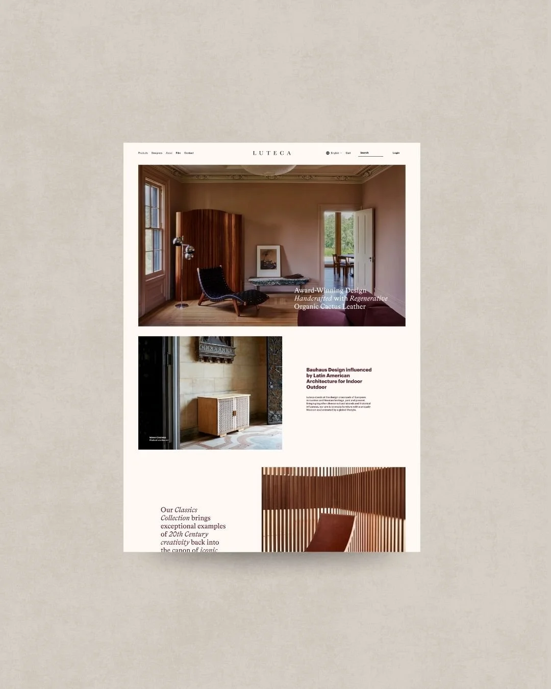
Luteca. Furniture Design Studio.
1. A clear visual hierarchy
A strong website tells visitors what to notice first.
Headings, supporting copy, imagery and calls to action should not compete for equal attention. Differences in scale, spacing, placement and contrast create an order that helps visitors understand each page quickly.
When everything is large, bold or animated, nothing feels particularly important. The website begins to resemble a collection of promotional messages rather than a coherent experience.
An expensive looking website uses emphasis selectively. The most important idea receives space and presence, while supporting information remains quieter.
2. Typography with a defined role
Premium website design is often associated with serif typography, but a serif font does not automatically make a website feel refined.
The more important question is whether the typography has been selected and applied with discipline.
Each typeface should have a purpose. Headings may introduce character, while body text prioritises clarity. Smaller labels, quotations and navigation can add another layer, but they should remain part of the same system.
Consider the scale, line spacing, line length, weight and relationship between styles. A distinctive font used without control can make a website feel less considered than a simple font used exceptionally well.
3. Imagery created for the business
Photography is often the greatest difference between a website that feels generic and one that feels specific.
For an interior designer, this may mean professional project photography that captures materials, proportions and smaller details, rather than relying only on wide room shots. For a product brand, it might include a balance of clear product images, close crops and editorial compositions.
Consistency matters as much as resolution. Images should share a relationship through lighting, colour, cropping or mood.
Stock photography can be useful in the right context, but it should not become the main visual identity of a business whose work is defined by its own perspective.
4. Generous but purposeful spacing
White space gives content room to be noticed, but simply adding large gaps between sections does not create sophistication.
Spacing should establish rhythm.
Related elements should sit closer together. New ideas should receive more separation. Page sections should feel distinct without becoming disconnected.
Inconsistent spacing is one of the quickest ways for a website to feel unfinished. A heading may sit too far from the paragraph it introduces, while an unrelated button appears attached to the text above it.
Purposeful spacing makes a website feel calmer because visitors can understand the relationships between elements without having to consciously examine them.
5. A restrained colour system
An expensive looking website does not necessarily need a limited or neutral palette. It needs a colour system that knows how to prioritise.
Choose a dominant background, readable text colours and a small number of accents with specific roles. A stronger colour might be reserved for important links, product categories or calls to action rather than appearing everywhere.
Using every brand colour with equal intensity can weaken the hierarchy of the page. The palette may be attractive in isolation but exhausting when applied across a complete website.
Restraint is not the absence of colour. It is knowing when colour adds meaning and when it becomes decoration.
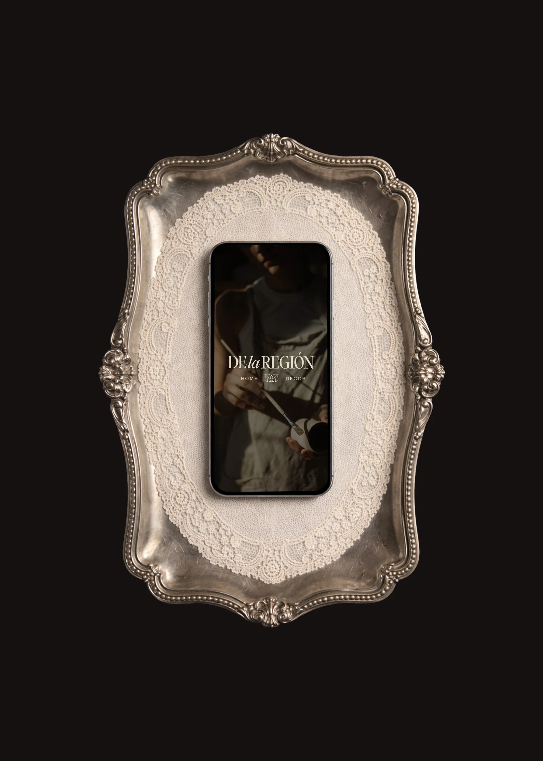
De La Region. Home Decor Studio.
6. Copy that has been carefully edited
Design cannot create a premium impression when the copy is vague, repetitive or filled with unsupported claims.
Phrases such as “exceptional service”, “unparalleled quality” and “tailored solutions” say very little unless the website explains what creates that quality.
Specificity feels more credible.
An interior studio can describe the way it approaches spatial planning, materials or project management. A consultancy can explain its method and the decisions it helps clients make. A product brand can communicate the origin, construction and purpose of an object.
Editing also affects the visual experience. Shorter paragraphs, confident headings and considered page introductions allow the design to feel more spacious without removing useful information.
7. Navigation that feels effortless
A website can look visually polished and still feel inexpensive when visitors have to work too hard to understand it.
Navigation should reflect the priorities of the audience, not the internal language of the business. Page names should be recognisable, service categories should be organised logically and important information should not be hidden behind clever labels.
For a creative studio, visitors may need quick access to services, selected work, the studio approach and the enquiry page. An e-commerce business may need clear categories, practical product filtering and visible delivery information.
Ease creates confidence. When the next step feels obvious, the business appears more established and prepared.
8. Small interactions that support the experience
Thoughtful movement can make a website feel responsive and complete.
A considered hover state, a smooth transition between images or a subtle change when a button is selected can signal care. These details are most effective when they help visitors understand that something is interactive or guide attention towards useful information.
Movement becomes distracting when every section arrives differently, text is difficult to read before an animation completes or the page responds excessively to normal scrolling.
The goal is not to demonstrate how much the website can do. It is to make the experience feel polished without making the interface itself the centre of attention.
9. A mobile design that feels deliberately composed
A desktop website should not simply be compressed into a narrow screen.
Typography may require a different scale. Image crops need to be reconsidered. Multi-column layouts need a clear order. Buttons must remain easy to select, while menus and forms should feel straightforward.
Details that seem minor on desktop often become highly visible on mobile. Awkward line breaks, oversized headings, excessive blank space or closely positioned links can quickly disrupt the experience.
A premium website should feel designed at every screen size, not impressive on desktop and merely functional elsewhere.
10. Technical polish that remains largely invisible
A website loses credibility when images load slowly, elements move unexpectedly, links lead to missing pages or forms do not provide clear confirmation.
Visitors may not describe these as design problems, but they still affect the way the business is perceived.
Optimised images, clear error messages, consistent button behaviour and stable page layouts create an experience that feels dependable. Google’s Core Web Vitals similarly assess loading performance, interactivity and visual stability as important parts of real world website experience.
Technical polish should not call attention to itself. It should remove the small moments of friction that make a website feel unfinished.
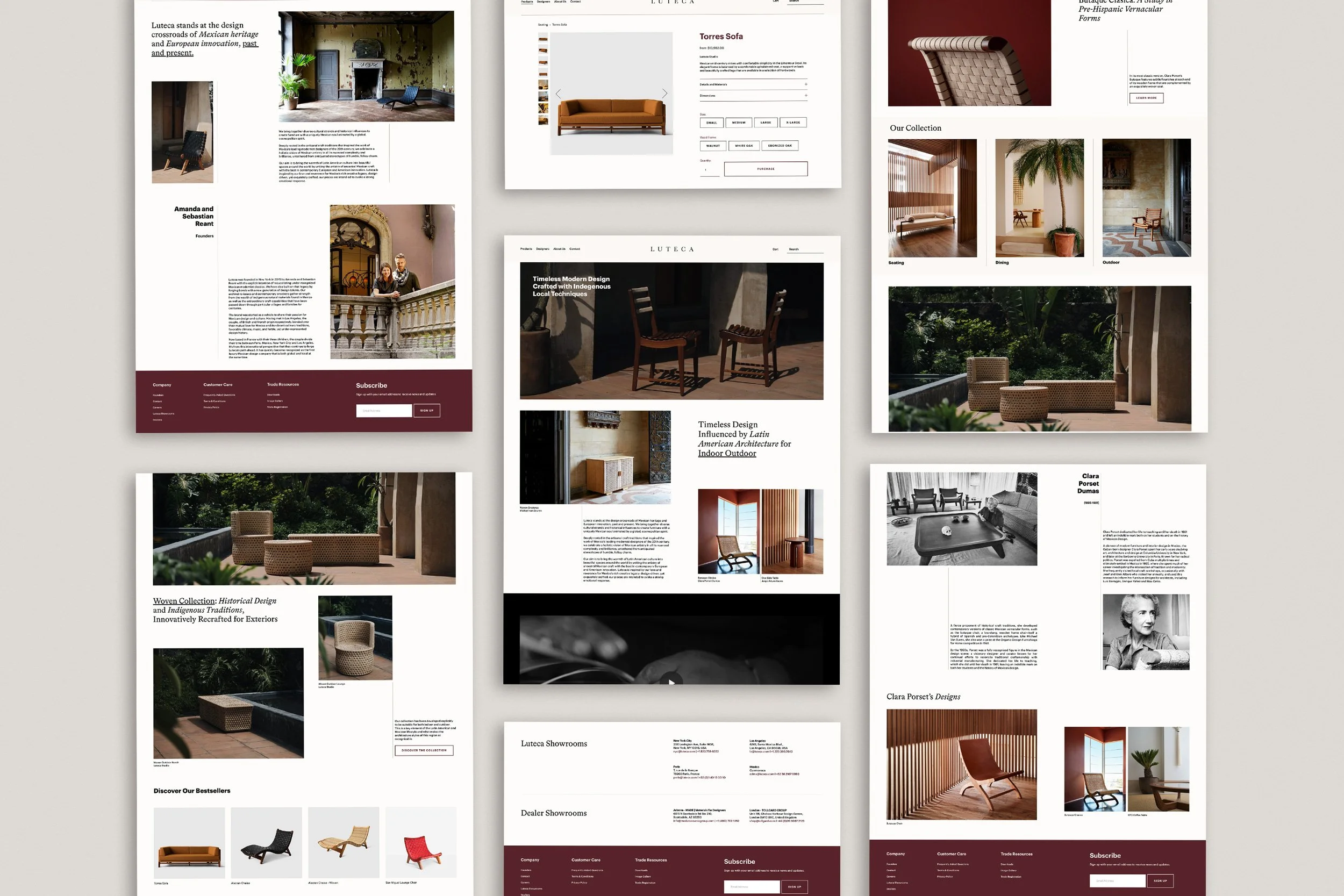
Luteca. Furniture Design Studio.
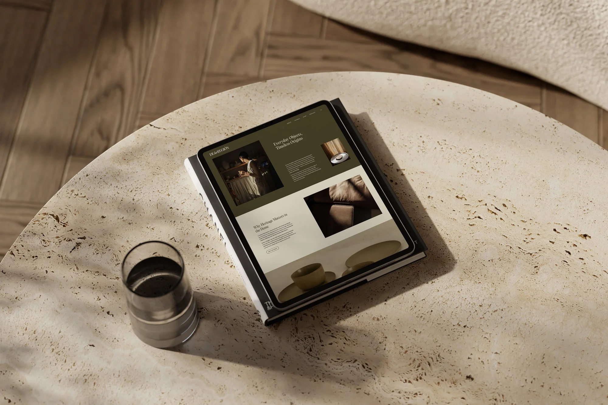
De La Region. Home Decor Studio.
What makes a website look expensive is coherence
None of these details works particularly well in isolation.
Generous spacing cannot compensate for unclear messaging. Professional photography will have less impact inside a confused layout. Refined typography will not repair a frustrating mobile experience.
The impression of value comes from the relationship between all of these decisions.
For a founder building a new business, this means choosing a clear visual and structural direction before collecting disconnected website features. For an established business, it may mean reviewing whether the current website still represents the quality, expertise and ambitions behind the work.
An expensive looking website does not need to appear extravagant. It needs to feel as though every element belongs there.
Frequently asked questions
Does a minimalist website look more expensive?
Minimalism can create a premium impression when the content, imagery and typography are strong enough to support it. Removing elements without creating hierarchy or character can make a website feel empty rather than considered.
Which fonts make a website look expensive?
There is no single premium font category. Serif, sans serif and display typefaces can all work. The quality of the result depends on whether the font suits the brand and is applied consistently across headings, body copy and smaller details.
Can a website template look premium?
Yes. A strong template can provide a considered foundation, particularly when it is customised with appropriate typography, imagery, copy and content. A template begins to feel generic when the original demonstration content and styling are followed too closely.
Do animations make a website feel more professional?
Animation can add polish when it supports navigation, feedback or storytelling. Too much movement can slow the experience, distract from the content and make the website feel less controlled.
Should every business invest in custom website design?
Not necessarily. A focused business with straightforward content may be well served by a carefully selected semi-custom website. Custom design becomes more valuable when the business requires a distinctive art direction, complex structure or specific customer journeys.
A considered website makes value easier to recognise
The aim is not to make a business appear more expensive than it is.
It is to ensure that the website does not make a considered service, well-designed product or experienced studio appear less valuable than it really is.
At Avelã Creative, we create custom Squarespace and Shopify websites for interior studios, creative businesses, consultancies and design led brands. Explore our Website Design service or start a project to create an online presence that reflects the quality of your work.
Where to Start
Your website should make the quality of your work easier to recognise. Explore our custom Website Design service or start a project to discuss a website designed around your business, audience and next stage of growth.